Situation
It was felt that the Totaljobs E-Commerce site for recruiters was losing out to its competitors.
The company wanted to take back market share by increasing conversion whilst creating a better series of showcase pages and improving how that information is discovered on site.
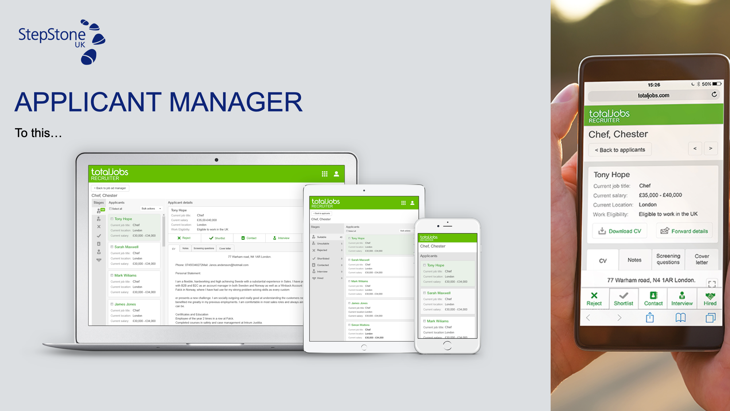
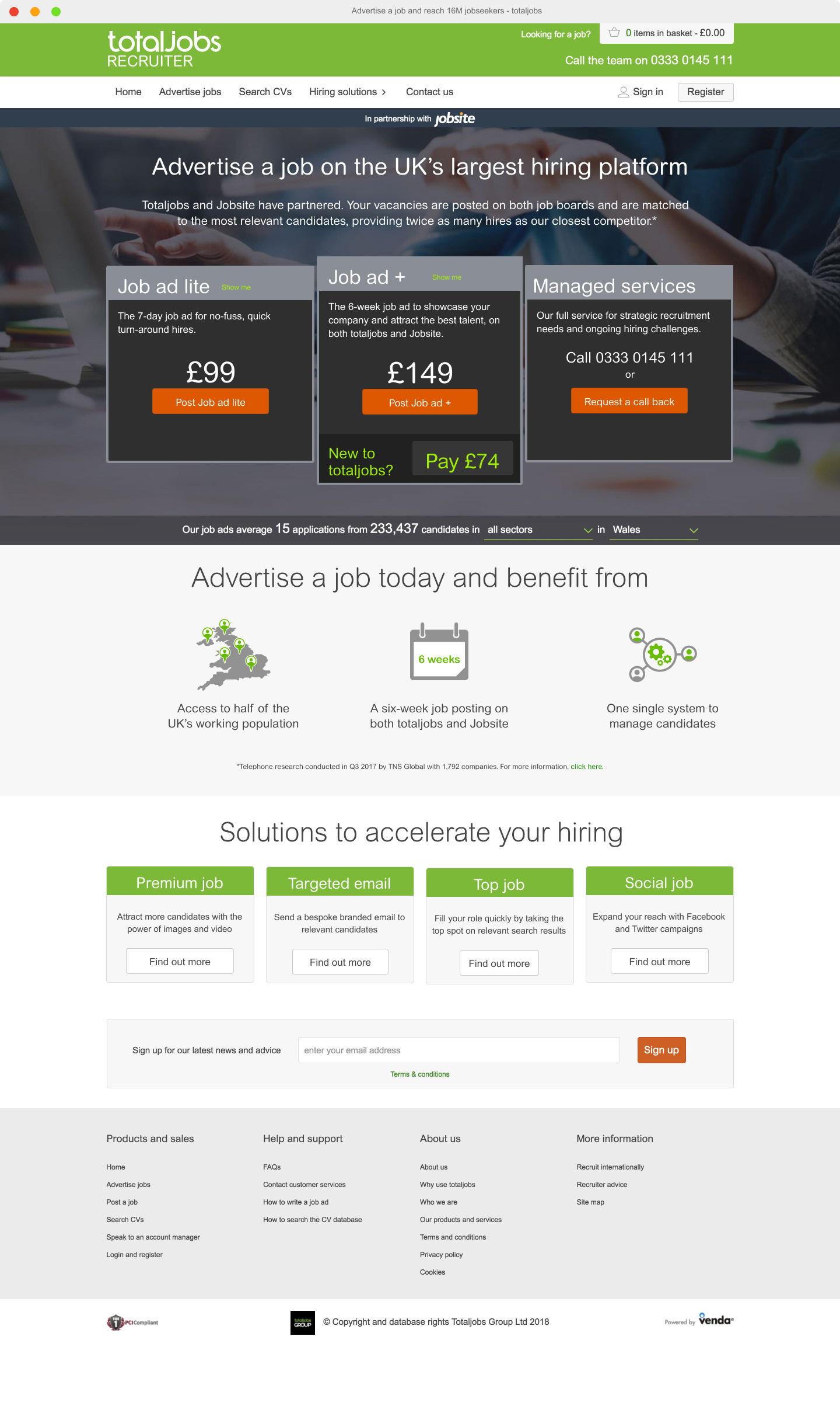
Old Recruiter Homepage
Task
Project requirements were as follows:
1. Increase purchase conversions
2. Create new pages to showcase full suite of products through a reimagined architecture.
3. Not to harm any return user journeys.
Activities
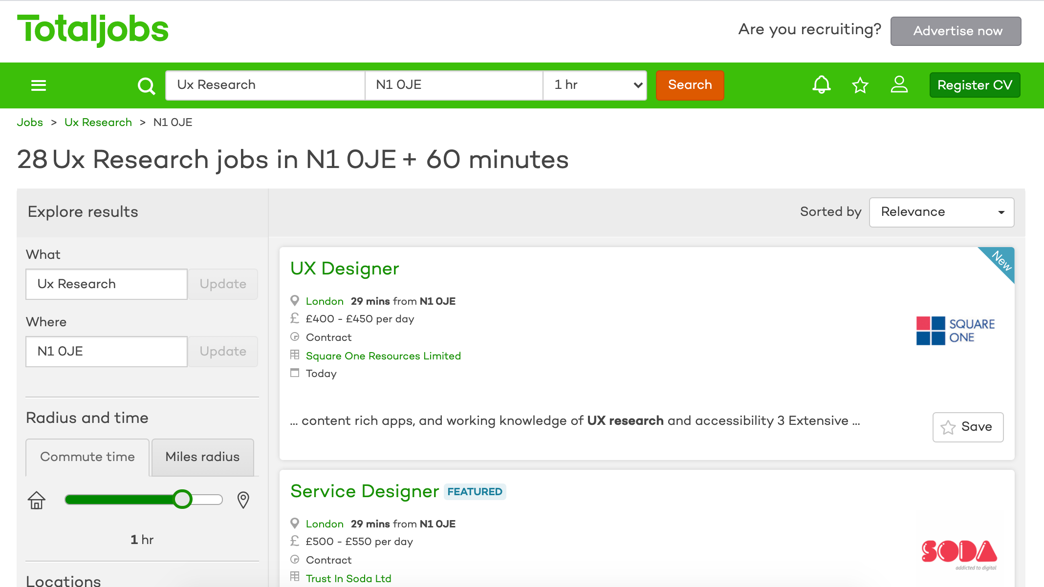
The first step in this project was to understand how the current page was working; the flows in and out, tasks being performed, and to understand the types of people using it.
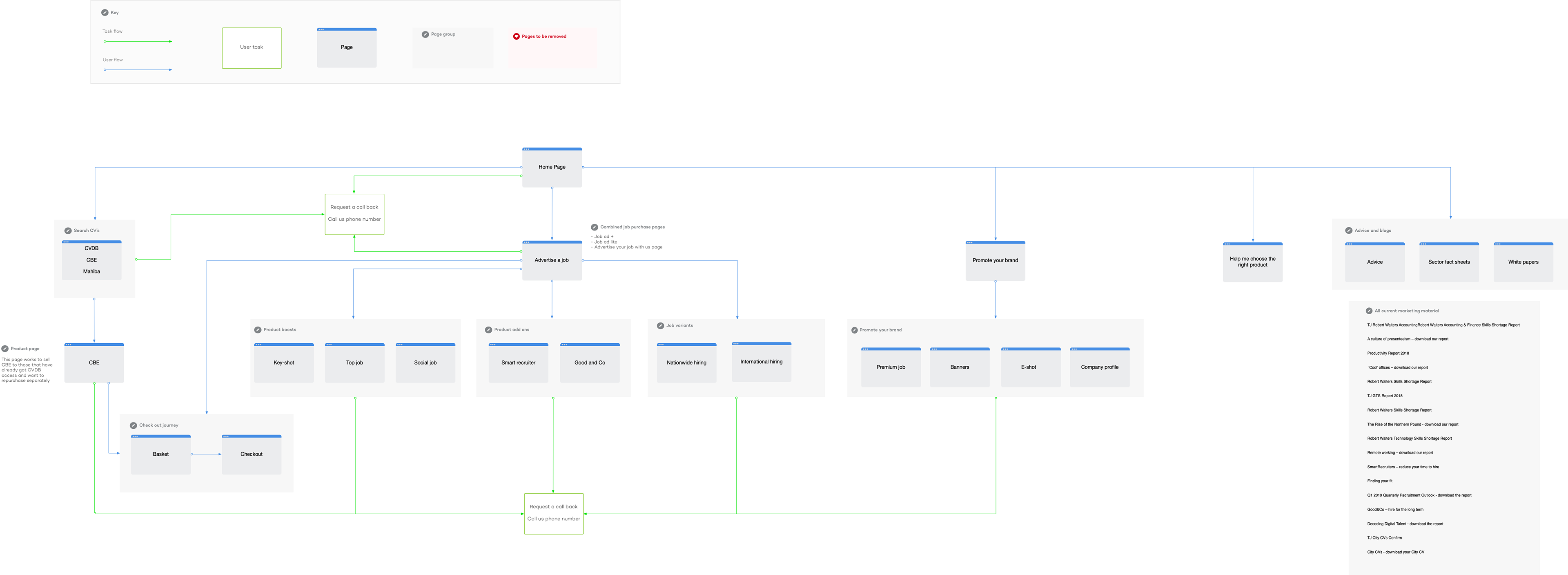
Current site architecture with general user flow. Google analytics data was added later to quantify traffic numbers.
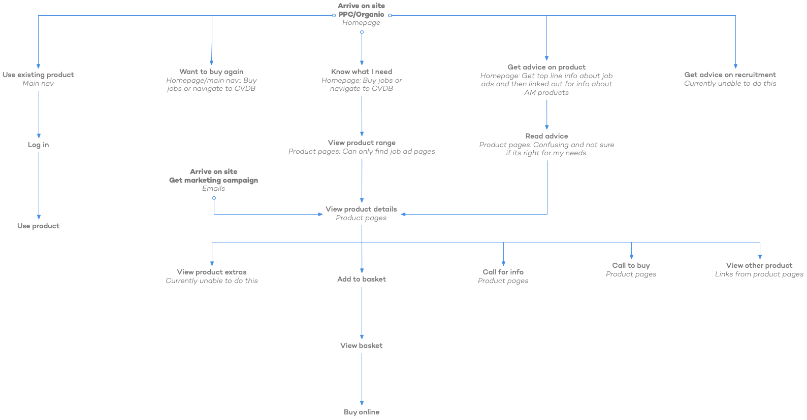
General site navigation based on user need.
Mapping out a possible future e-commerce site based on user need.
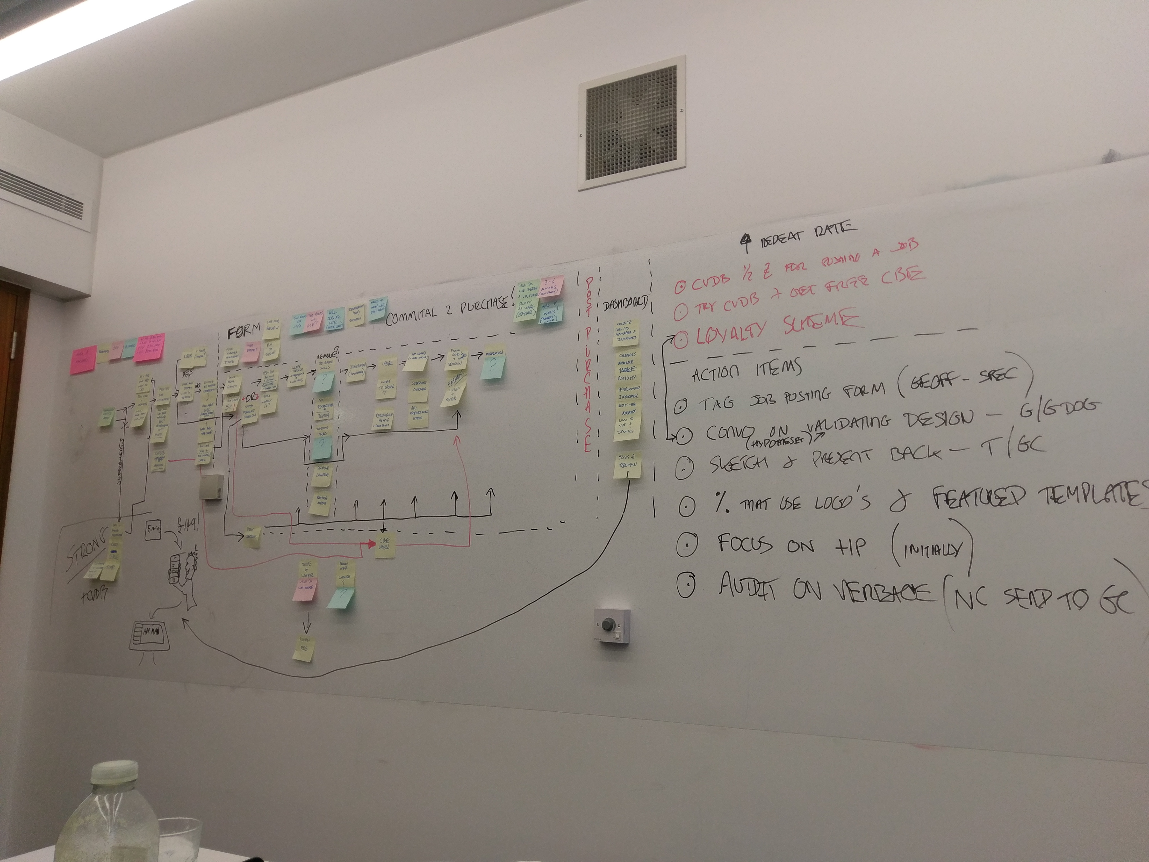
Next, we created basic wires and simple prototypes to show to our identified user groups. This was about quick feedback to ascertain if our hypotheses were correct and we were heading in the right direction. This was the time to radically change ideas and potential outcomes. Once stakeholders bought into our concepts it would be much harder to change direction down the road.
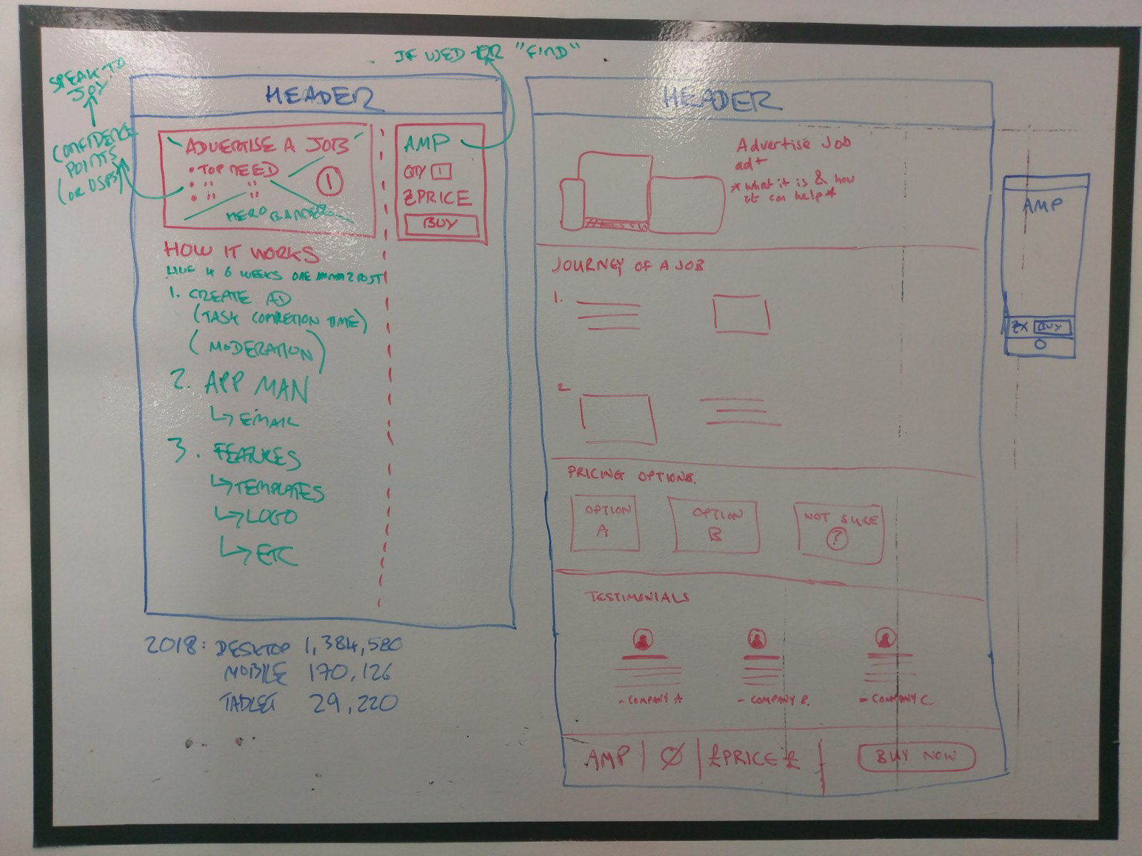
Quick and early wires.
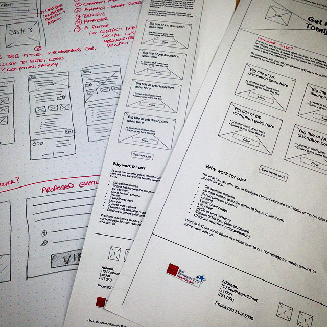
Moving from whiteboatrds to Axure to produce quick wires.
Once our hypotheses were tested and validated. It was time to create high fidelity designs and prototypes to test.
High fidelity prototype created in Sketch and Framer.
After testing the high fidelity prototypes it was ascertained that using a sticky primary purchase CTA and removing a page and consolidating the information we were able to increase conversion by 12%. This was discovered through a series of multivariate tests and google analytics over a period of 4 months.
Results
By moving the product page forward in the new user journey we were able to reduce the amount of steps necessary to get the required information the user needed to make an informed decision. We then created a sticky primary purchase CTA which enabled the user to click at any time whilst reading information. We reduced the clutter and additional CTA's from the page making it easy for the user to see the purchase button. Even though the page is longer, scroll maps showed a large increase on people reading the information to the bottom and then clicking the sticky purchase CTA.
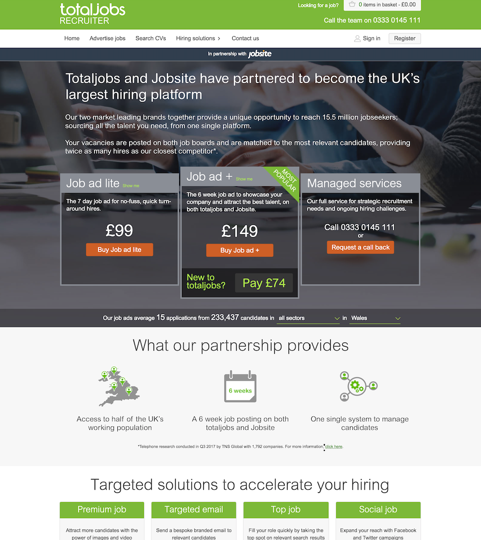
Original product page for purchasing a standard job.
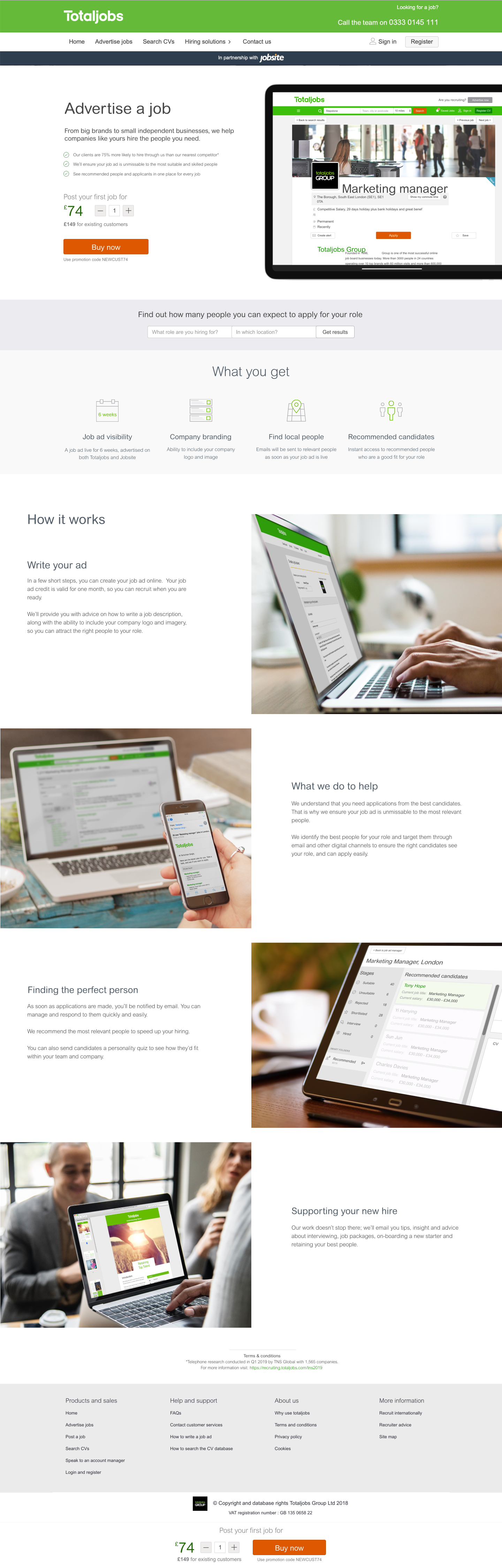
New product and purchase page.