Situation
Attempting to keep the Totaljobs platform competitive was a continuous work in progress. The company used innovation and hack days to promote fresh ideas.
A larger research project highlighted a new trend in how jobseekers were searching for roles. Gone were the days of traveling anywhere to work, now people wanted a perceived higher standard of living from not having to travel for long periods of time. Commute Time was a concept put together on a hack day event utilising Google Maps API. Our concept won, we were then given a limited scope to create something usable to prove user desire.
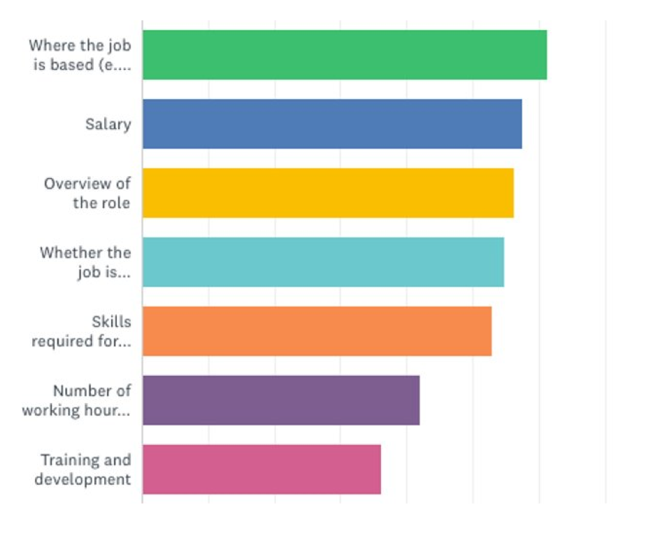
Approx 2500 jobseekers replied to a Survey Monkey poll asking what aspects of a job they find most important. Amazingly where the job is based was more important than salary.
Task
Understand the best touch points in the jobseeker journey.
What would the search functionality be for different users, i.e. logged in/new user/etc?
What kind of information would we display?
Where would we display it for the different user types?
Actions
Understanding the journeys and user touch points was an important part of this project, so first we mapped it. We did this by understanding how traffic enters the site and to understand if a user was returning or new, this was easily achievable by checking the analytics
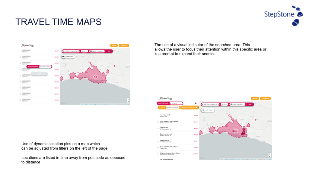
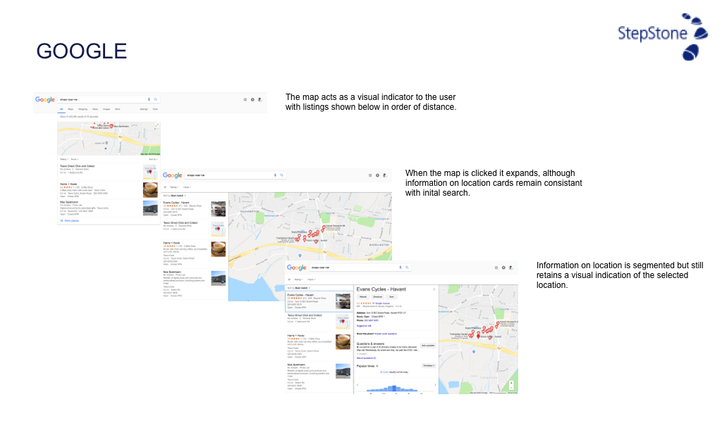
Once we understood touch points and users we needed to benchmark other sites and perform some market analysis.
We now know what the user types are, their journeys, and we understand the design patterns used by other sites. Now is the time for design discovery, creating as many versions of the concept as possible allows us to explore and discover designs and experiences that may not have been recognised before.
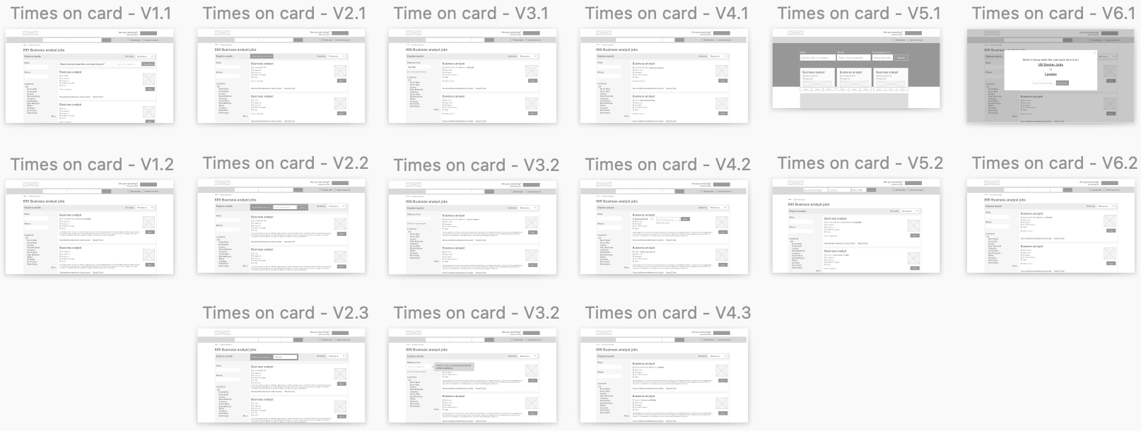
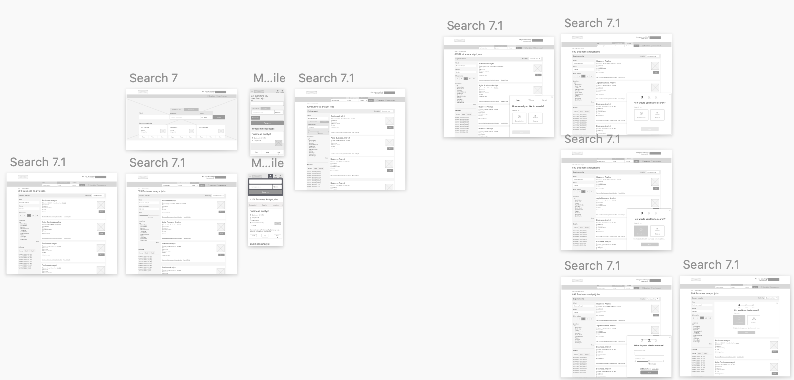
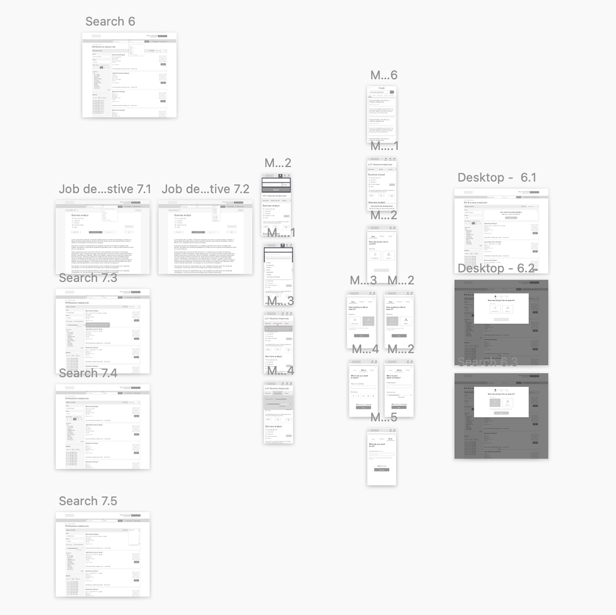
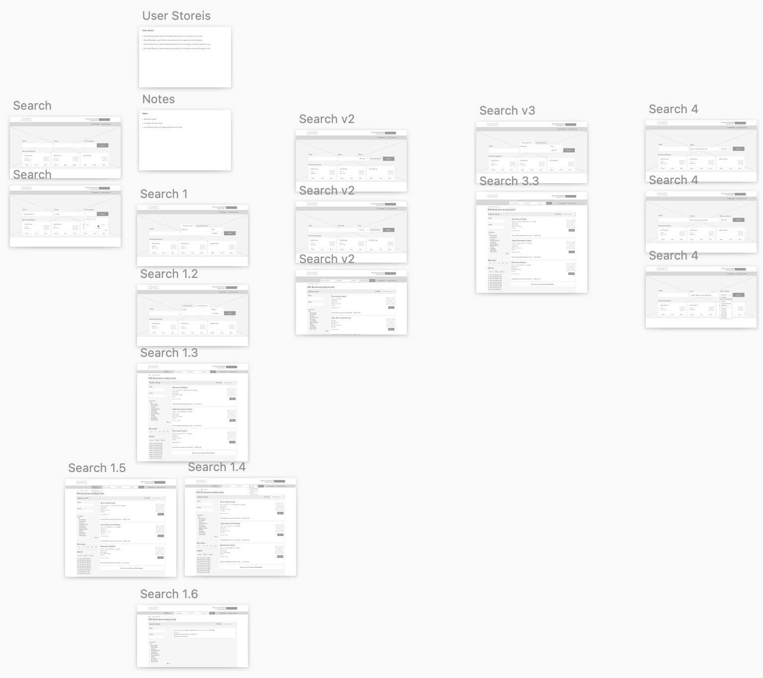
Out of this chaos comes some clear insights. In this instance we needed the functionality to be introduced at the right time and having it upfront on the homepage felt intrusive. It was deemed better to make the functionality the top filter on the search results page. We narrowed down our concepts and started a quick round of testing.
We created three prototypes in Axure and started testing in cafes on our laptops. The first prototype in the set of images bellow received 65% of the first choice votes. Users found it easy to understand and simple to use.
Now that the functionality was nailed down it was time to move to design and implementation.
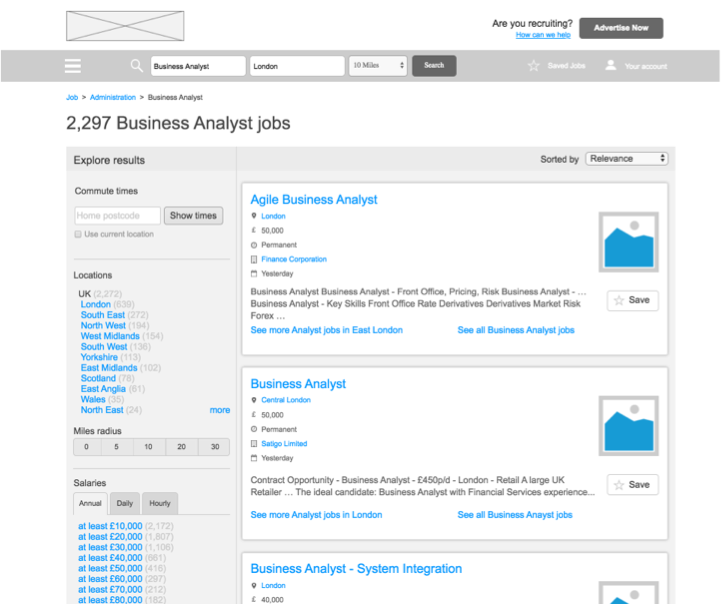
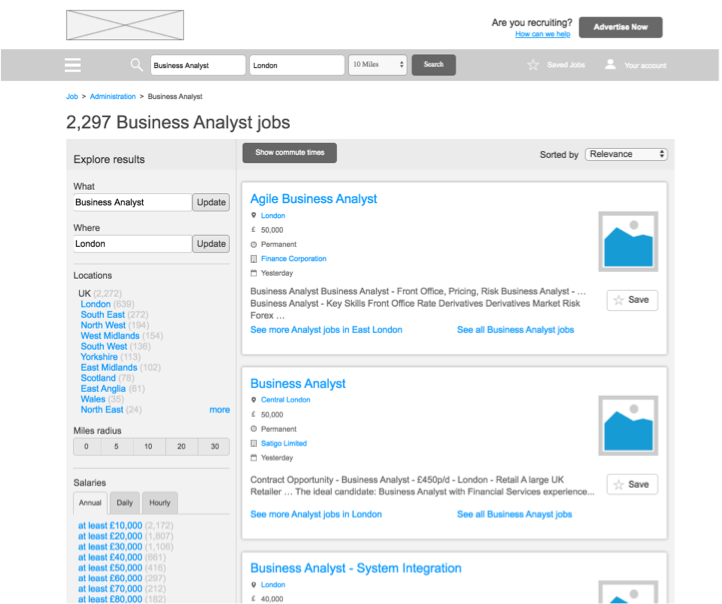
First iteration of commute time on desktop results page
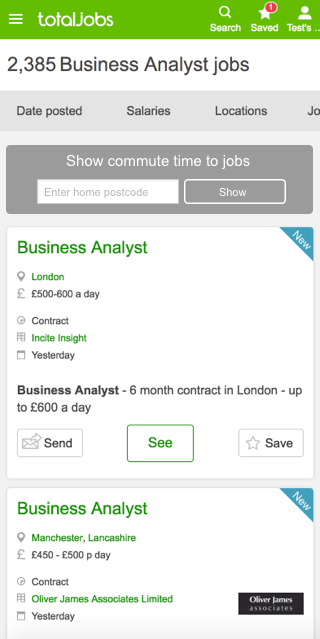
First iteration of commute time on mobile results page
Results
After a week of live usage it was clear to see that users in certain areas of the country were interacting with it more than others, in rural areas it was more likely people would have to travel for work whilst in the cities it was the deciding factor in what roles people would apply for. It was decided to move forward with a second iteration of the project where we started to introduce icons, customisable settings and maps. Some of these failed but over time the experience became richer and is now a recognised filter on the site.
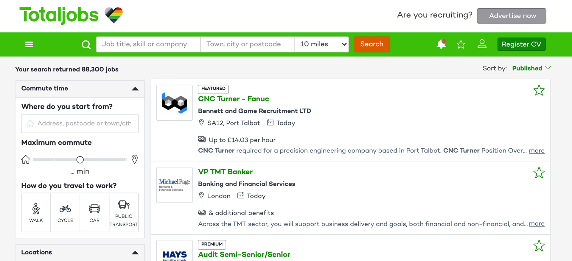
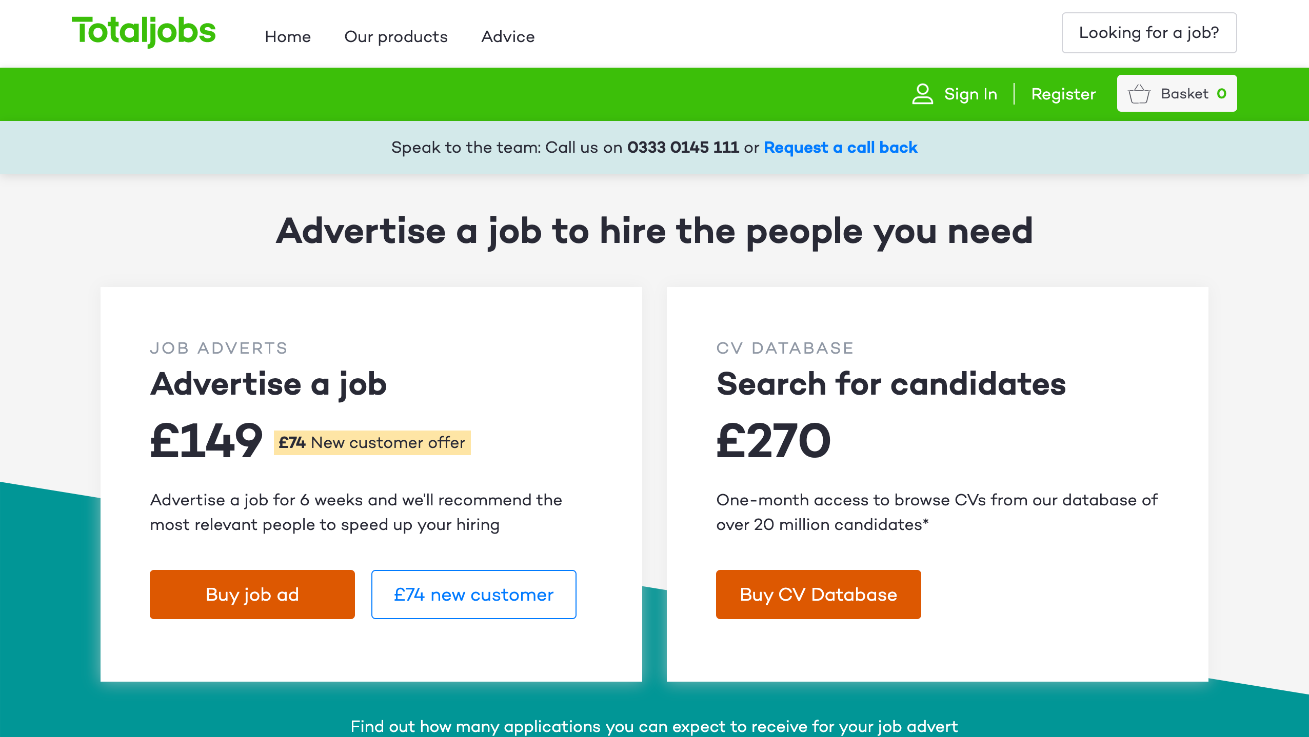
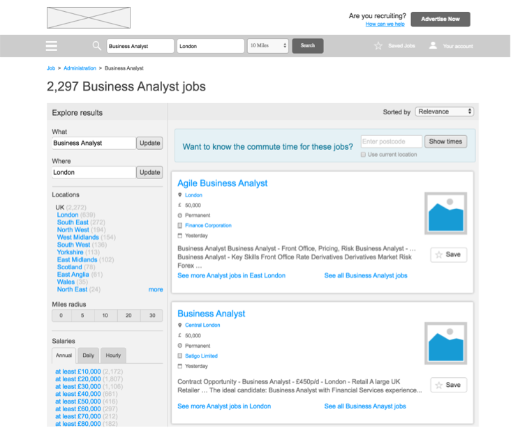
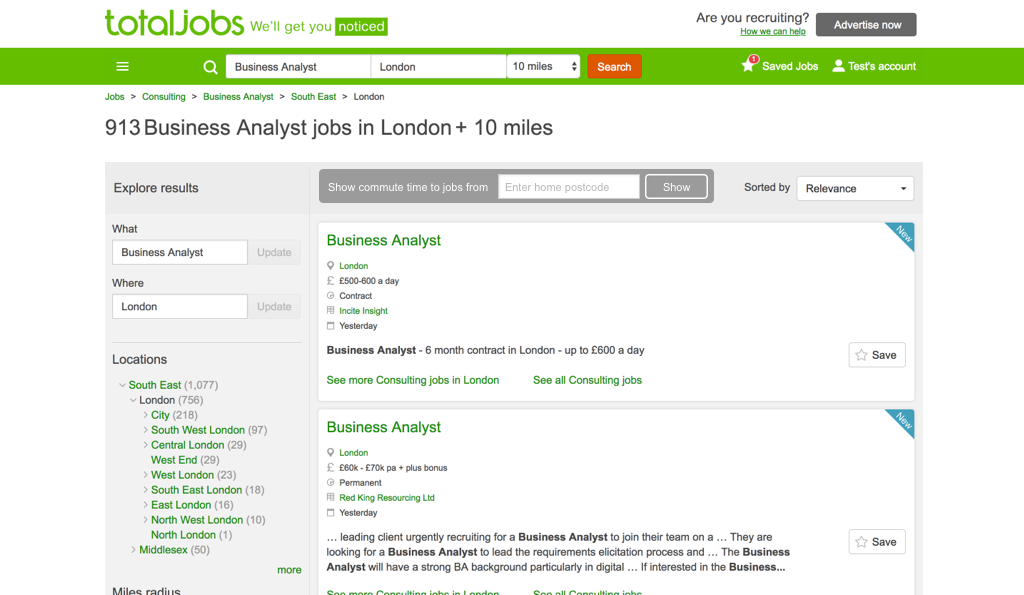
Current site with commute time at the top of filters.