Situation
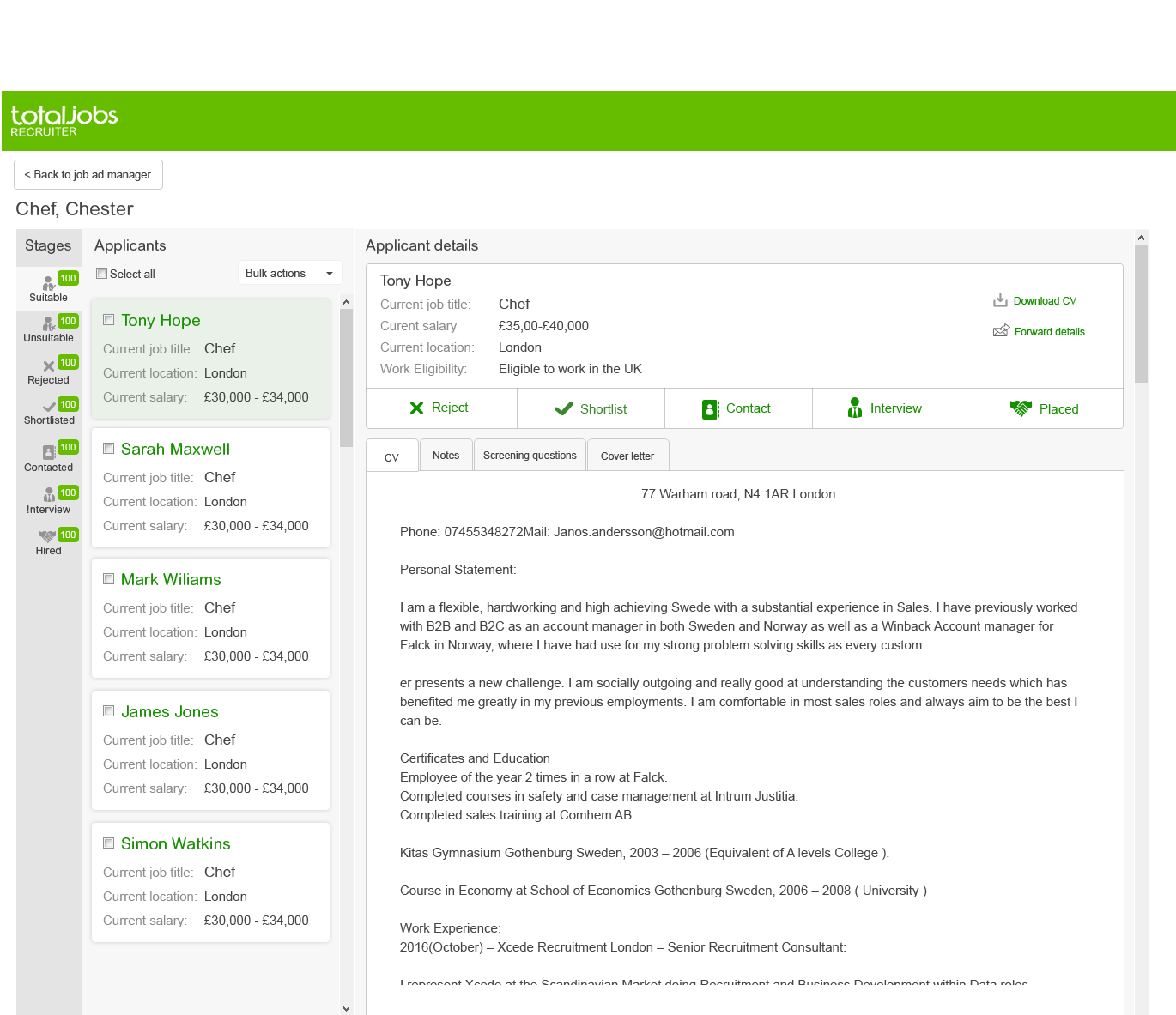
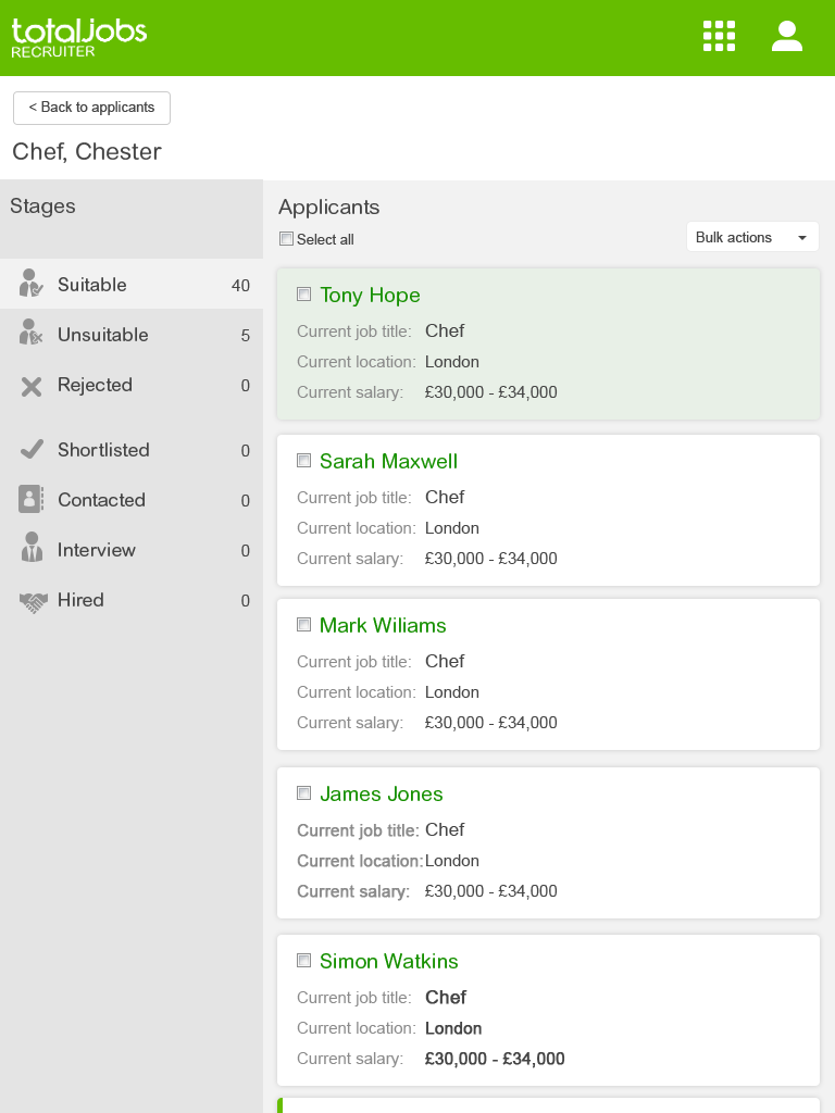
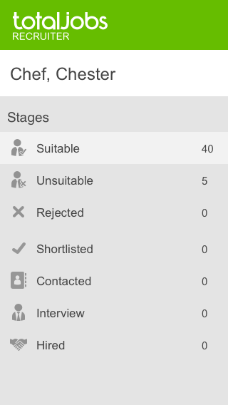
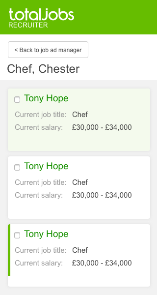
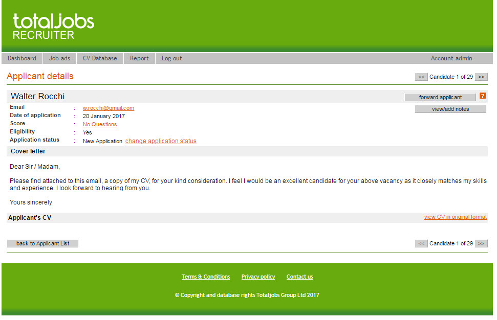
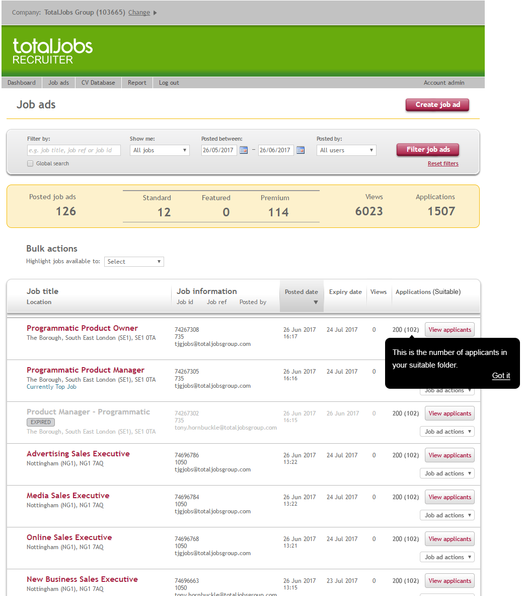
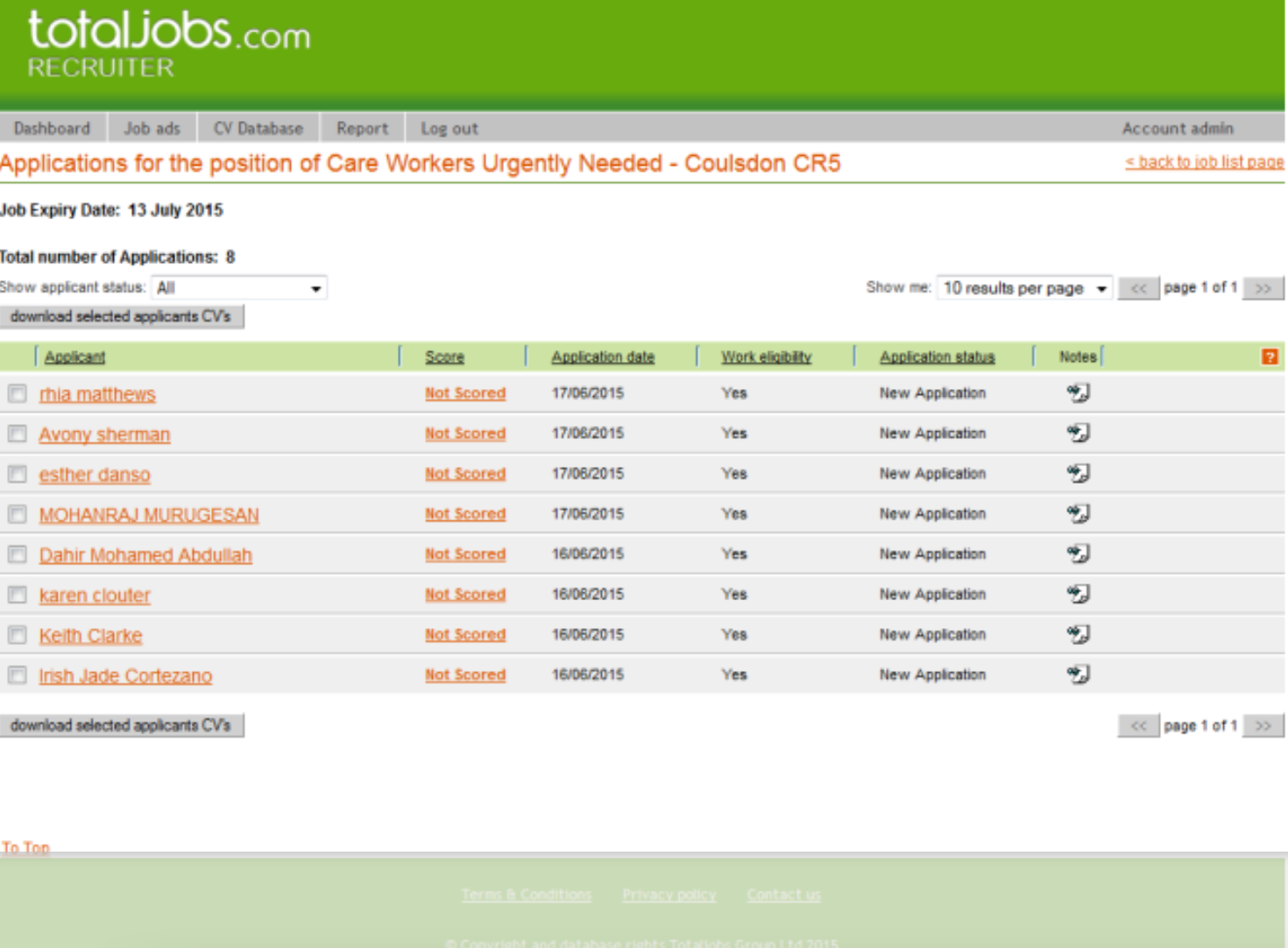
One of the most outdated areas of the Totaljobs platform was its back office offering for recruiters. Non-responsive, badly designed and cumbersome it was necessary to revamp and create a modern framework for a new and improved responsive solution for all verticals. 
Job Advert Manager page was old, unresponsive and hard to use but still got 54,000 visits a week. The next page in the journey is the Applicant Management page but it only saw 15,000 visits a week. Finally, the Applicant Details page and the most important page in the journey got 4,000 a week. This was a clear indicator that something was wrong and offered an obvious opportunity for improvement. Thus, our main KPI was retention of existing users. 
Task
Understand who our users are and what they need. 
Understand user journeys, touch points and possible issues with changing so much of the platform at once.
Set up a research plan and timeline.
Design and discovery. 
Continuous user, stakeholder feedback sessions. 
Work directly with designer and scrum team during build to mitigate errors. 
Activities
Initial work began with understanding what we currently have onsite and how it is used. I used a tool called Mouseflow to see how current users interact with the pages. By utilising screen recordings and heat maps, it's quick and easy to build up an understanding of user behaviour. 

Heat maps show whats being used on the page most

Interpreting findings is just as important as discovering them. 

Next was understanding the routes to and from the pages. This was done with Adobe analytics. We discovered that most users land directly on the page from their email notifications, this was something that hadn't been expected. 
Whilst we needed to understand routes in, we also needed to know the main user journeys and task flows. It's important in a large project like this that we know exactly what the user will be interacting with so that we can mitigate any dead links or worst of all creating issues around the user's primary journey. 

User journeys show what pages the user will hit along an identified tasks route to completion as well as success and pain points. 

Task flows help to identify what your users do and the decisions they make along the way. 

Here I have had to create a kind of hybrid map in order to visualise what we doing for stakeholders. 

We then needed to work out who the new offering would be for. We did this by undertaking a number of user group focus sessions. These enabled us to get a quick overview of the qualitative aspects of the site whilst getting a better understanding of our users needs. Once we had established a primary user group, namely small/mid size enterprises, we then performed more intense in-depth interviews (IDI). 

Using a script whilst interviewing keeps you on track and helps to negate leading questions. 
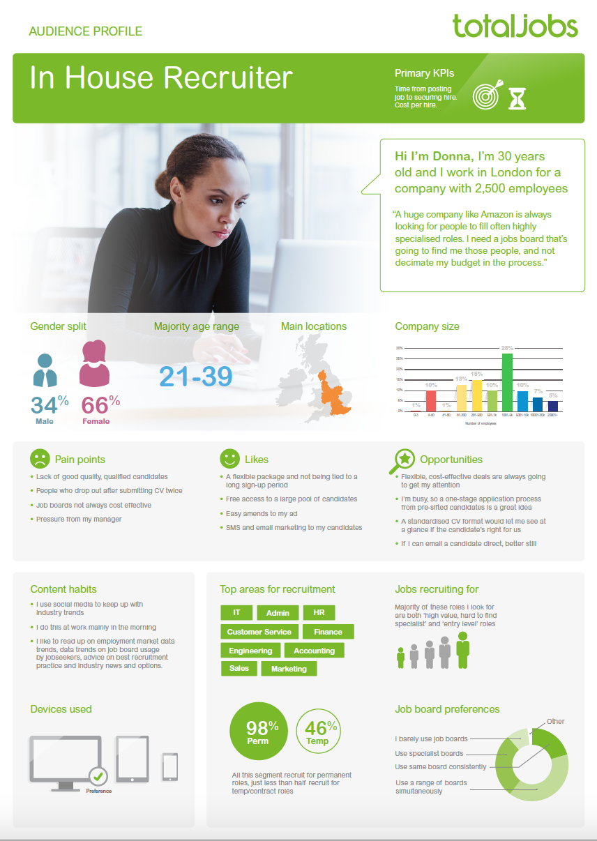
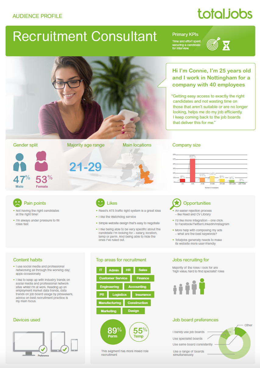
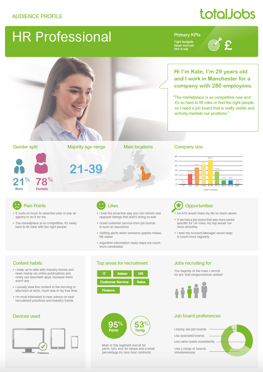
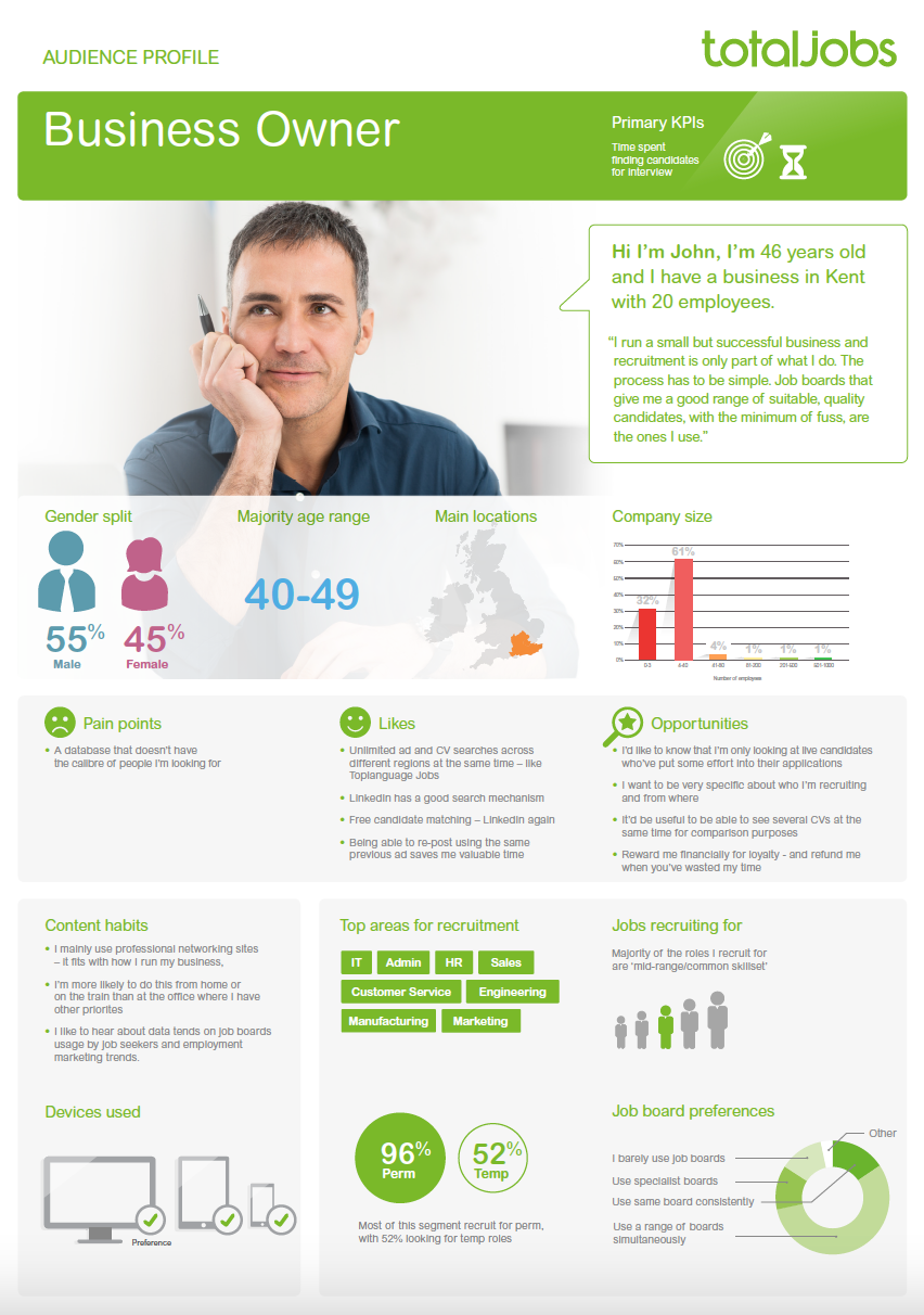
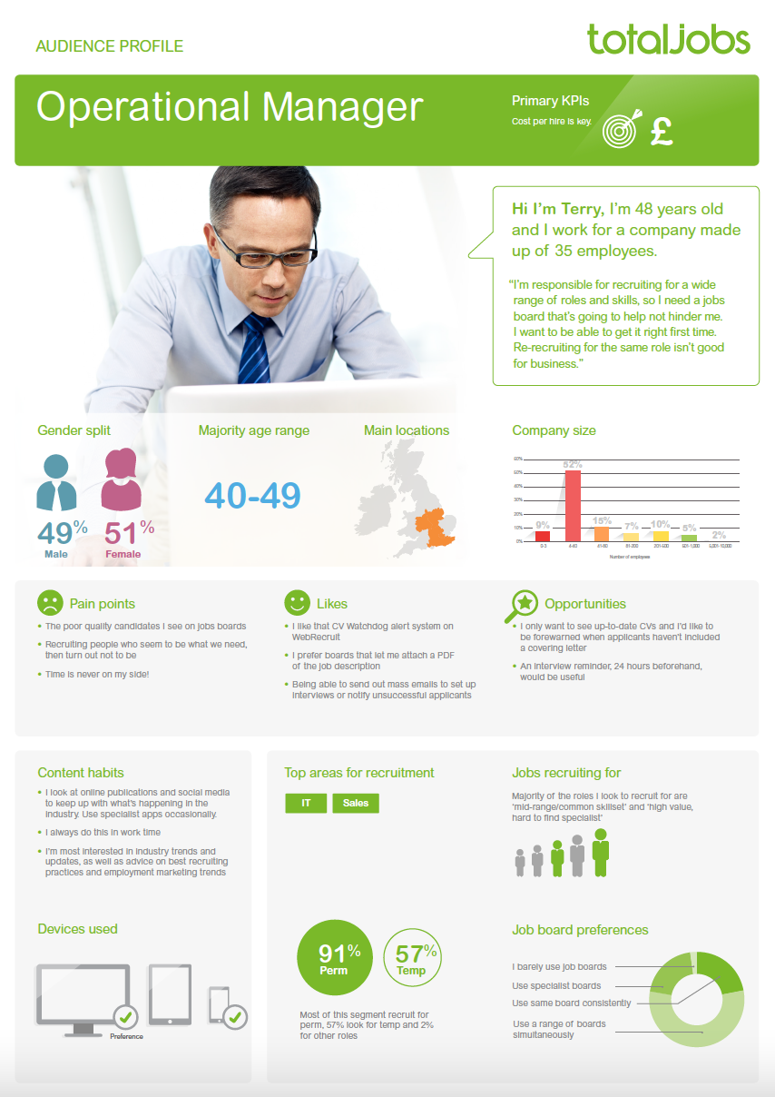
Creating a group of personas is a great way to keep design teams, scrum teams and stakeholders on the same page with regard to who you are all doing the work for. Quick proto-personas are perfect for UX teams but higher fidelity always works best for stakeholders and those that don't understand the UCD approach.
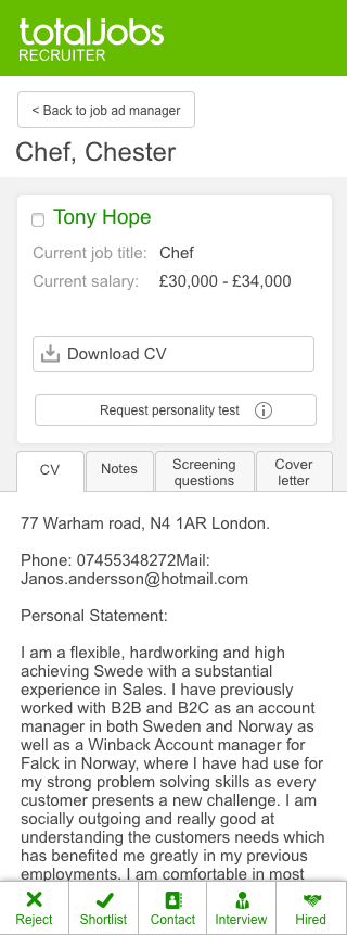
Next steps were to conceptualise the new user experience. I worked through a number of concepts before settling on a simple design paradigm that our target users would understand easily - the email inbox. The hypothesis was that by using a design language that was already second nature we could onboard existing and new users quickly. 

Working low fidelity and quickly is the key to covering as many concept as possible. It's important to fail quickly at this stage.

Once main concept is decided its time to make basic wireframes and sense test them with stakeholders. Its still possible to change our minds at this stage and not cause major issues. 

Now that the concept is agreed it's time to do in-depth testing with your primary user groups. Depending on budget this can be done remotely or in person. It's often advantageous to do testing in the place that the user feels most at home, it helps to get a more normalised response. 

In depth user testing on a prototype allows you to gather precise feedback, which will directly affect your design. It is also great for bringing back to stakeholders to promote the importance of UX research. Additionally users feel a sense of ownership of the product and deeper ties to your brand. 
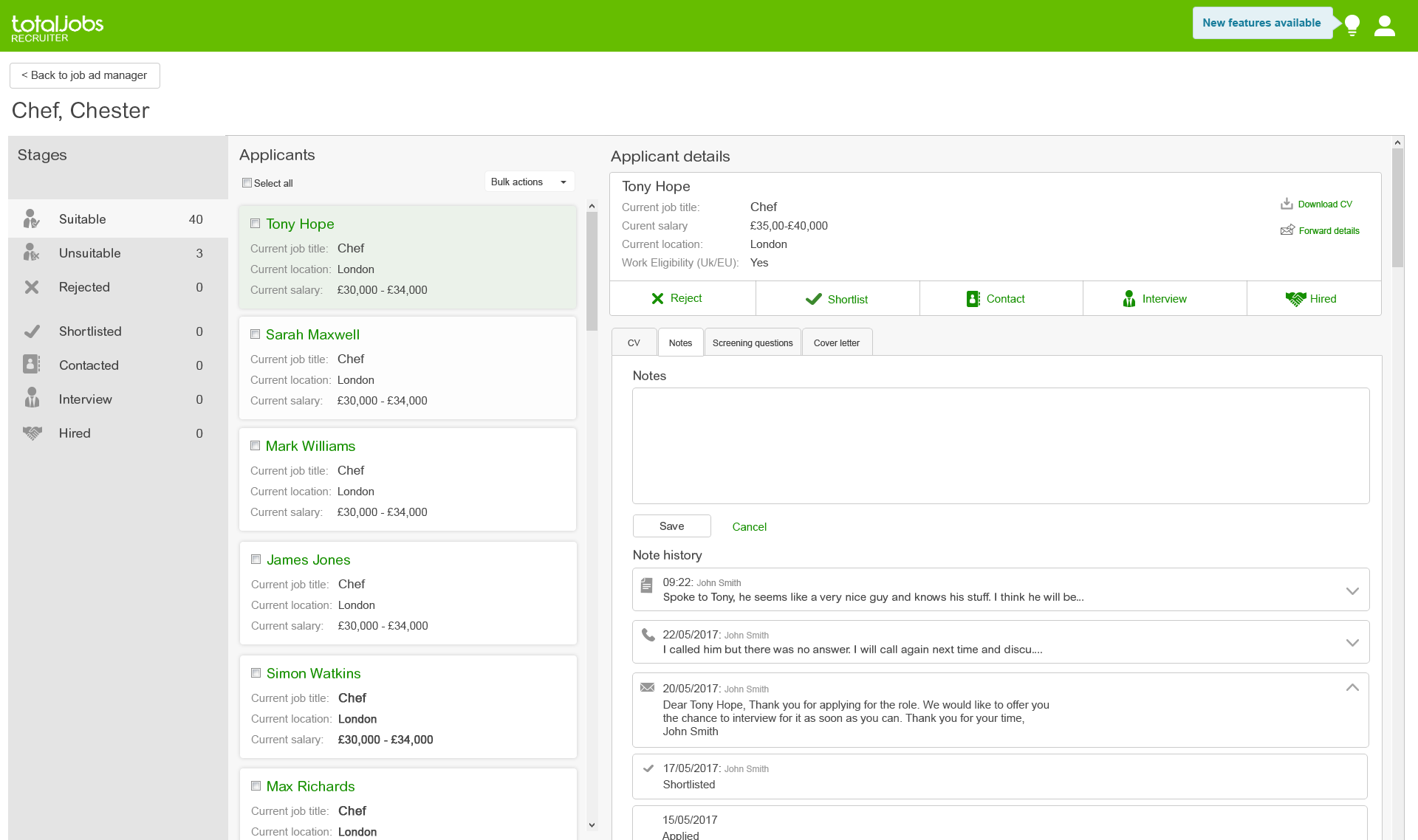
After gathering feedback it's time to asses the UX and make the changes required. We did this whilst moving to a higher fidelity. This is a great stage to test micro-interactions and any key design aspects that will affect the UX. 
We implemented a lazy load feature after discovering users felt that content wasn't available to them when it loaded slowly from our servers. 
Once the designs were complete for all verticals and all view points it was time to complete build and start an alpha release to small numbers of sympathetic users. We used trusted clients and our original testers to give feedback when using the product in the real world. This helped to clear up any teething issues in a safer environment.  
Result
It took more than a year to release version one of the responsive applicant manager. Straight after release we saw a sharp upturn in people using the platform and a huge increase in those using on mobile and tablet, which was a primary KPI. The trend continued as time past and this is the real success. When released we sent out an email campaign and talked to clients about the new back office which accounted for the quick upturn, but the fact they stayed and continued to use it shows we made a quality, usable product.
Key takeaways
Before responsive applicant manager was released we saw approx 60,000 visits on desktop to the applicant manager. Second month of release saw 130,000 and by July the next year 365,000 visits on desktop. Thats an increase of 508% in 15 months.
Mobile usage saw similar gains but on a smaller scale. Long term analysis showed that most recruiters are doing their jobs at their desks during work hours. We saw an increase in mobile use during morning and evening commutes. Tablet usage went up in the evenings this was because users sat in the evenings on the couch assessing candidates before work the next day. 

More case studies

Back to Top